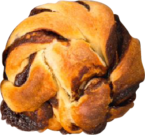
Irreverente is an artisanal bread workshop, cooked up by a self-proclaimed bread enthusiast in the lively city of Querétaro, México.
Their goal? To charm bread explorers and make them swoon over creations made with only the very best ingredients. All this through a brand that's friendly, organic, and unforgettable.
They want to sneak their way into the daily lives of our explorers and fellow bread aficionados.
Unleashing Irreverente's essence!
Irreverente's brand already had a main logo, but something was missing to tie it all together. Ale, the owner, envisioned a mascot that could convey the energy behind her dream—a character that would help the audience connect with the brand and make them feel, 'Hey, that's me!' Once we captured that essence, we could create a cohesive logo suite.
The moodboard contains a set of illustrations that embody the irreverent spirit: a lack of respect or seriousness, unapologetic, and true to their passion for food. Explore a glimpse of the experimentation process that gave birth to Irreverente's brand character.


Irre is the energy and spirit personified by all our bread explorers. It came to life thanks to those who challenge society, questioning the forms, flavors, and stories behind bread.
It doesn’t hide its love for good food; it celebrates it, applauding those who savor every bite, enjoying the flavor, texture, and love baked into each loaf.
Irre aims to reach the heart of every bread explorer, hoping the world seizes the chance to experience "the sensation" that comes with eating bread. From the buttery aroma that gently melts in your mouth, to the satisfying crunch when you bite into it, to the way flavors blend on your palate.
And with each loaf's end, may there always be a desire to share the happiness and delight that comes with every bite.
Designed to fit seamlessly into any space!
Irreverente already had a main logo composed of Desmon Sans Serif, which has a strong presence, essentially stating 'Here I am!' The Script font Halimun adds balance to the logo. Irreverente's mascot matches the font's line weight, creating a cohesive whole. The logo suite consists of elements from the primary logo, designed to adapt to various scenarios where the brand will be active.


Even the smallest element of the logo can act as a brand identifier. The key is to make it memorable so it remains in the audience's mind.
For the brand pattern design, we drew inspiration from Irreverente's best-selling pastries, creating illustrations that match the character's line weight and incorporating phrases in the accent typography.


Since you're here, share the exciting details of your project with me!